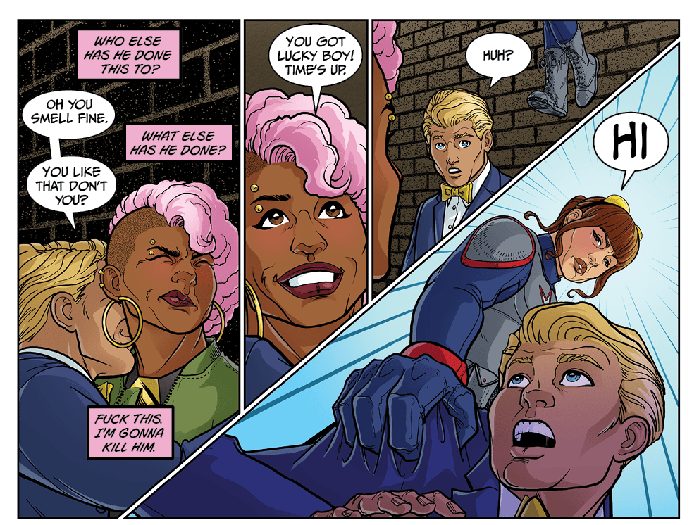
I spent a crazy amount of time on that one word word-balloon. Fonts. Placement. Size. Position. Still not sure I like it. Then there’s the cursing. I almost went #$%@ with it, but I hate that stuff. Two pages back I did bleep the same word. When I go to print I’ll have to re-letter one of them. Not sure which I’ll change.


Good, this jerk about to get what he deserves.
Give him the Hancock “asshole” special…….
Toss him straight up into the atmosphere,”just” high enough that he can still breathe, then catch him “just” before he hits the ground……………..
Interesting idea. I’ll point out that the story was written six months ago, and the art done 2 months ago…
If this is to read true, leave the swearing. It IS situationally appropriate.
That’s how I feel. I have to consider how it limits publication, but the world is a lot more permissive these days.
If your core audience is to be adult women, don’t change it. I’m liking it, so far.
Thank you. You’ll get to meet the full team shortly. Need to end this scene, introduce the real villain, then on to to the full team with a bit more light hearted stuff.
It wouldn’t make much sense to be able to depict a sexual assault but not be able to print ‘bad’ words.
You would think. But many advertisers and digital publishers have rules agsinst swear words, not violence.
Rip his head off and bowl with it.
Damn…legally it’s only sexual assault even if morally it’s attempted rape (and the DA could certainly make a case for attempted rape). Okay, knee him in the nuts. I’ll happily be your witness, no thanks needed. Turd-burgers like this guy deserve the worst.
My only complaint is that this guy’s art is too cartoonish. He needs to look like he could actually be a person she could encounter on the street instead of a refuge from Clown College
The script called for a frat boy and my artist had fun with it. But the style is real.
As woman, predators come in all shapes and sizes. The ones that looks harmless are often the most dangerous.
The navigation on this site is terrible. At the very least, a link to the latest page would be useful.
There are 3 links on the front page. Are you using a phone? The phone layout isnt great.
Ill look into making the latest comic link more obvious.